
Deleter Screen Tones & Halftones
 I was at Heroes Con back in 2015 and talking to Mr. James Harren during a portfolio review. I asked him how the hell he was getting these amazingly controlled ink splatter almost gradients, and he told me he wasn’t. He was using halftone sheets. He pulled out his portfolio with some of his originals, and inside was a few sheets of Deleter Halftone Sheets. James actually handed me a full sheet, which was beyond kind of him to do (this one, SSE-492 for the curious). It took me a really long time to actually ever even use it, but it started up a pretty costly interest in halftones. Today, I’m going to talk about some tips and tricks with halftones from Deleter and also go into some helpful tips on what exactly you are buying (because their website is not very new consumer friendly!)
Screen tones, Halftones, or sometimes Zip-a-tone after an old brand, was used mainly before computers as an easy way to add shading to original line art. A tonal pattern, ususally repeating dots at 45 degree angles of various sizes creating value shades that are printed on clear film that can be applied to paper. This practice mostly died in the early 90’s, but kept going on in Japan to this day. Deleter is pretty much the only game in town to get Screen tone or halftone sheets at this point, unless you find a cache of the old stuff on ebay.
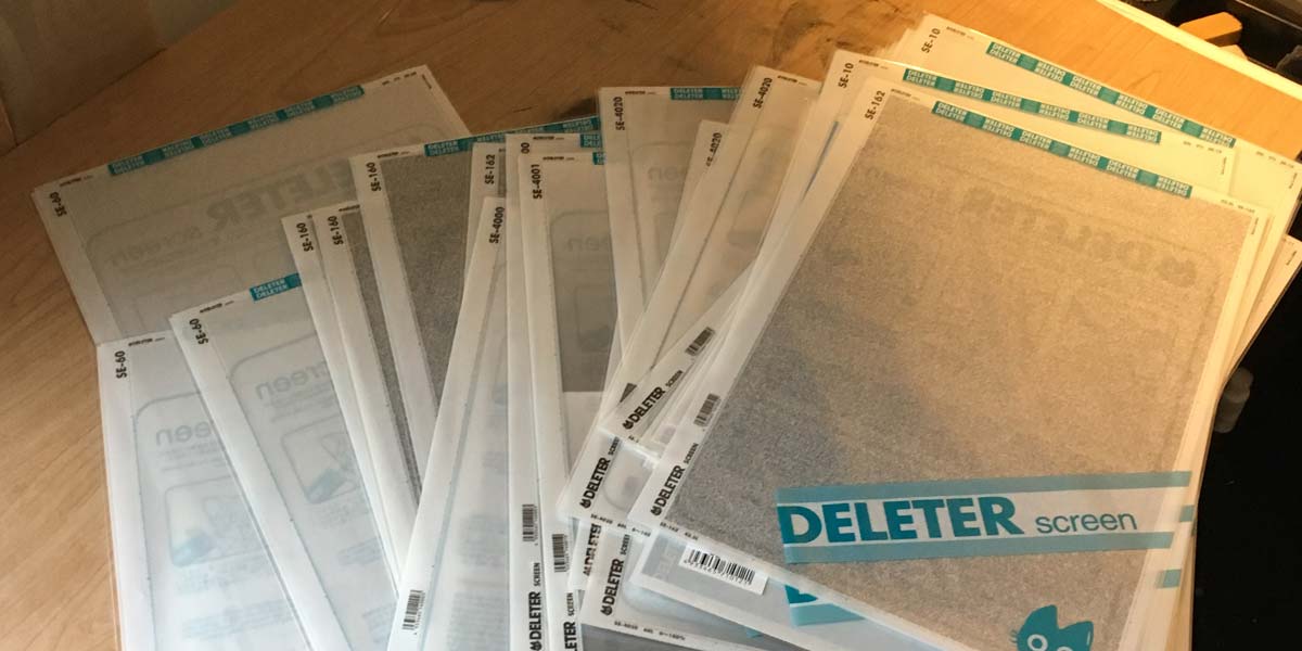
Deleter Screen Tones come in 2 sizes, the Jr’s, that measure 9”x6.5” of actual usable screen tone (the sheet is a little larger than that, but that’s either blank space or markings on the outside you can use for measurements). Regular sized Deleter Screens are 13.75”x9”. JetPens has a few Junior Sheets, but they cost as much as the full sized sheets on Deleters Website, so maybe try some Jr’s on your next JetPens order before ordering from the source. They all come in plastic bags that are resealable, so you can keep them from getting scraped up or dirty.
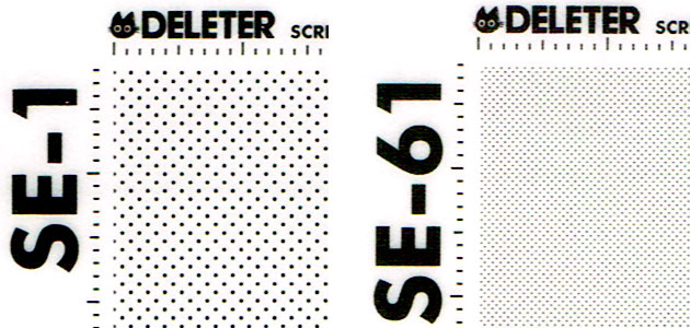
Screen tones are measured in Lines, more precisely, Lines per Inch. This is a 300 DPI raw-ish scan of 10% gray, on the left you have 27.5 Lines per inch, on the right, 60 Lines per inch. 27.5 is generally as low as they go, and 60% is on the high side, but some are 70 lines or so. Technically, these should be the same gray, but they give very different effects, especially depending on how they are presented. If you want the halftones to be extremely noticeable, especially if you work on the larger side (standard 11”x17” Boards), you might want to err towards the bigger ones, because as you reduce the size of your image, you’ll start to lose the look. One sad tradeoff of the digital age is that you can’t really control how an image is seen, it could be on a 100” screen or a 3.5” screen. As the images get smaller, your work can go into a weird transitional stage and enter into a moiré pattern, which is generally quite distracting and most people don’t like it.
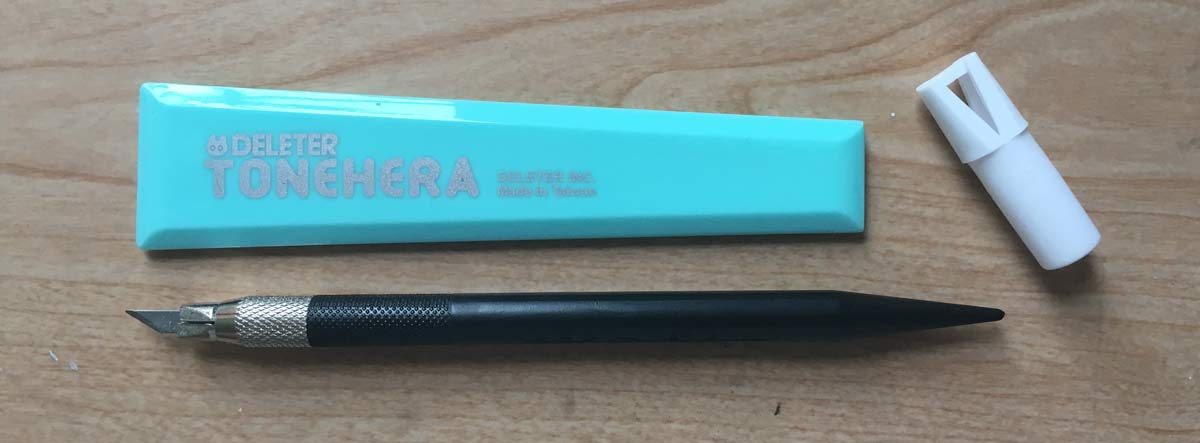
Most people generally cut out a rough shape from the large sheet with a blade (X-Acto knives work great, Deleter has their own tone knife, it’s a little smaller, a little less angled to make scraping easier, but not a necessity at all), place it down on your drawing, and then either cut away the excess or just scrape the tones you don’t want. I personally will err towards just cutting it unless it’s a really small piece, then scraping is probably the best route. From here, you’ll want to rub down on the tones to make sure they are adhered well to the paper and there aren’t any air bubbles (air bubbles will create a very distracting look), and if you already have a bone folder that will probably be good enough, or you can get Deleter’s Tone Hera, which is really cheap on their site. This is also a very important part for a reason I discovered much later.
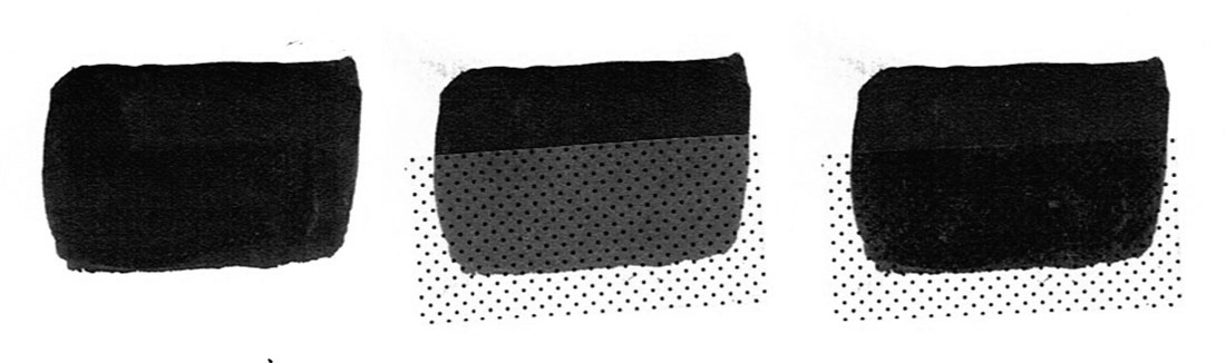
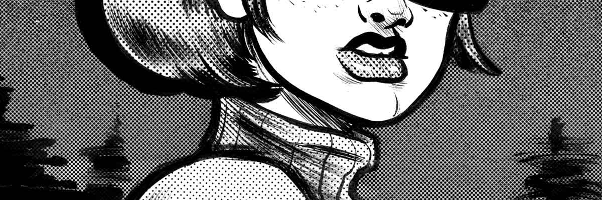
When you initially place down the tone, the blacks of the ink below are going to be lightened. A bunch. It’s annoying when you start out, you feel like you did something wrong. The secret is to press down on them. Hard. Above is an example of the difference between original inks, initial placement with no pressure applied, and then pressing down on the tones with a tone hera to reduce the amount of change to your black inks.
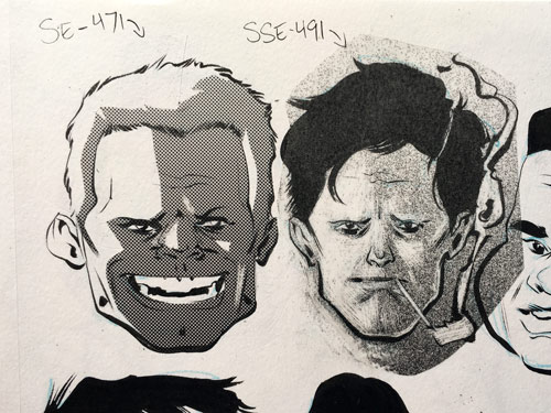
Below is a quick set of images showing the application process, just to get a feel for how they are used. I mostly cut on the left (with a SE-471 screen tone, and a SSE-491 screen tone on the right), and scraped on the right.


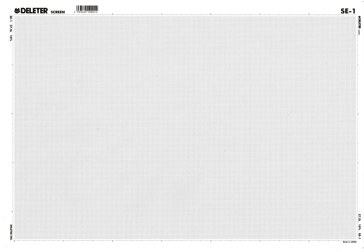
If you end up buying any of these, I suggest getting one or two from the varying lines per inches (27.5, 30, 40, 60), a few shades (10%, 13%, 20%, etc.), a few gradients, and a few of the crazy ink splatter looking ones, just try them out. They do have scans of most o the screens, but usually at a lower resolution and a little hard to tell exactly what it will look like, especially with more textured tones. Shipping from Deleter is generally pretty quick for coming from Japan, and I’ve paid anywhere between 10-30 dollars depending on how much I ordered (if you order just screen tones it will probably be cheaper). You might want to try the juniors at first, but at $2.95 for a junior vs $4.59 for a full sheet that’s twice as big, it’s much more economical to go for the big ones once you’ve decided what you like. They also have some interesting white options, to think about, like SE-1(W), which is used in the final image of this post. If anyone has any questions, email me and I’ll try to clear up anything you might be wondering about.

Post Tags:
[guide